A practical, Pune focused guide to learning ui ux design with live, instructor led and mentor led Figma training, from your first frame to your first job offer.
There is a moment most people in Pune will recognise. You are stuck on the Hinjewadi flyover or crawling past Kothrud at six in the evening, scrolling an app on your phone, and something about a checkout screen makes you smile. It just works. The button sits exactly where your thumb expected it. Nobody explained anything to you, and nothing needed explaining. Behind that tiny moment of ease sits a ui ux designer who spent weeks worrying about how you would feel when you tapped.
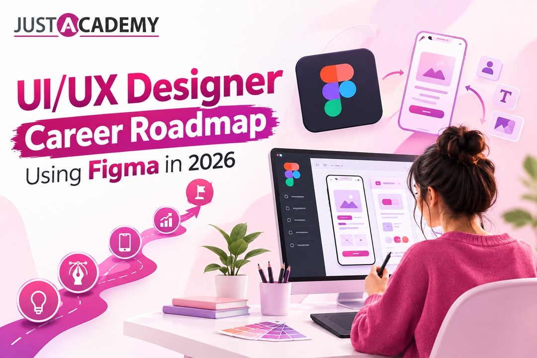
If that quiet kind of craft interests you, this roadmap is for you. It walks a beginner in Pune from zero to a first design job in 2026 with figma as the main tool, and it argues that the way you learn matters almost as much as what you learn. If you would like to see how structured training feels before reading further, you can look at the Figma course in Pune that JustAcademy runs, or simply book a free demo session and watch a real instructor teach a real class.
Think of what follows as a long conversation rather than a lecture. We will talk about what the work really involves, which basics you can safely learn first, how figma fits into the picture, a month by month plan, how to build a portfolio people actually open, where entry level jobs are hiding, and how live and interactive, instructor led and mentor led sessions can shorten the whole journey. Grab a chai. It is a long read, but every section is meant to be used.
Why 2026 Is a Surprisingly Good Year to Begin
Every few months somebody announces that design is finished, that artificial intelligence will draw every screen and that juniors should look for another line of work. Then a company launches a new product, and the first thing it needs is somebody who understands people. Tools that generate layouts are common now, and they are useful. But a generated layout is a guess. Somebody still has to decide whether that guess helps a tired shopkeeper in Nashik reorder stock at night, or whether a first time investor truly understands a risk warning. That decision is the job, and it has stayed stubbornly human.
Pune is a wonderful city to begin in. Product companies, fintech teams, healthcare platforms, edtech startups and global capability centres sit within a short ride of each other, from Kharadi to Magarpatta to Baner. Nearly all of them have a design team of some size, and most of those teams are short of people who can think clearly and build properly in figma. Demand for ui ux web design keeps growing because every business, even a small bakery in Aundh, now needs a website or an app that does not embarrass it.
The honest catch is that the front door has become narrower and pickier. Hiring managers open hundreds of portfolios that look identical: the same food delivery redesign, the same meditation app, the same neat colour palette. What they remember is thinking, not decoration. So the winning move in 2026 is not to learn faster than everyone else. It is to learn with more feedback, more real problems and more conversation than everyone else, which is exactly why the later sections lean so heavily on live, mentor supported learning.
What a UI UX Designer Actually Does All Day
Ask ten people what a ui ux designer does and you will hear ten different answers, most of them about colours and fonts. Colours and fonts matter, but they are the icing. The cake is understanding a person, a problem and a business goal all at once, then shaping a screen that respects all three.
The Difference Between Looking Good and Working Well
User interface is the visible layer: buttons, typography, spacing, icons, the mood of a screen. User experience is the entire journey around it: why someone opened the app, what confused them, how long the task took and whether they came back tomorrow. You will often hear the phrase ux designer ui designer used as if these were two different species. In a small startup one person usually does both. In a large company the work may be split between a researcher, a visual specialist and an interaction designer. Either way, design and ux are inseparable, because a beautiful screen that confuses people is only decoration.
A restaurant makes a good comparison. The interface is the plating, the menu layout and the lighting. The experience is booking the table, the wait, the way the waiter reads your mood, the bill arriving at the right time. Nobody praises a restaurant for plating alone if the soup arrives cold.
A Typical Tuesday
Picture a designer at a Pune product company. The morning begins with notes from Monday's usability test, where three of five users missed the save button. A quick call with the product manager follows, because a feature keeps getting abandoned halfway. By noon the designer is inside figma, redrawing a flow so that the confusing step disappears. In the afternoon a developer asks what should happen when the internet drops during payment, and the designer realises nobody designed that state. The evening goes into a rough sketch for tomorrow's workshop.
Notice how much of that day involves listening, questioning and explaining, and how little involves drawing pretty things. If you enjoy that mix of empathy, logic and craft, you will probably enjoy this career.
Titles You Will Meet Along the Way
Job boards use many names for overlapping work: product designer, interaction designer, visual designer, ux researcher, ux writer, design system specialist. Some people join a ui ux agency and work across many clients in quick succession, which builds range fast. Others join a product company and live with one product for years, which builds depth. Neither path is superior. Your first role is simply a place to learn, so choose the one with better mentors rather than the fancier title.
Start Here: UI UX Basic Ideas That Save You Months
Most beginners open a design tool first and learn principles later, which is like buying a guitar and skipping chords. The ui ux basic ideas below are small enough to learn in a week and large enough to improve every screen you ever make.
Start with hierarchy, which is simply deciding what the eye should see first, second and third. If everything on a screen shouts, nothing is heard. Then spacing and alignment: generous, consistent spacing makes an interface feel calm and trustworthy, while random gaps make it feel careless even when users cannot say why. Next comes consistency. A button that looks and behaves the same everywhere teaches people your product without any instructions. After that, feedback: when someone taps, something should visibly happen, whether a spinner, a tick or a gentle colour change. Finally accessibility. Contrast, readable text size and touch targets that fit real thumbs are not extras. They decide whether a grandfather in Satara can use the app you designed.
The Process Behind User Experience Design
User experience design follows a loop rather than a straight line. You learn about people through interviews and observation, define the problem in one clear sentence, sketch many possible answers, build a quick prototype of the promising one, test it with real users and go around again. The loop feels slow at first. It becomes faster and far cheaper than building the wrong product, which is the reason companies pay for it.
Design Thinking Is Not a Buzzword When You Use It Properly
You will hear design thinking and innovation mentioned in the same breath so often that it starts to sound like a slogan. In practice it is a habit: stay curious about the person, reframe the problem before solving it, and test cheap ideas early. Teams that practise design thinking for innovation rarely fall in love with their first idea, because they have seen how often the first idea is wrong. Many corporate workshops now teach innovation & design thinking as a formal method, but you can practise it alone with a notebook. Pick any annoying everyday experience, such as paying a maintenance bill in your housing society, and redesign it three different ways.
Figma Without the Marketing Noise
Figma is a browser based design tool where designers draw screens, build reusable components, connect them into clickable prototypes and share everything with teammates in real time. It won the market for a simple reason: several people can work in the same file together, and developers can inspect the design without asking for exports. For anyone learning figma for ui ux design, that collaborative nature is a gift, because it mirrors how real teams work.
The core skills are less scary than the interface suggests. Frames are your screens. Auto layout makes elements resize and rearrange themselves, so a button grows when its label grows. Components and variants let you build a button once and reuse its states everywhere. Prototyping links screens with taps and transitions so a stakeholder can click through an idea without any code. Variables help manage colours, spacing and modes such as light and dark. Comments and developer handoff features keep the conversation attached to the design instead of buried in chat threads.
You will see many searches for ux figma tutorials, and most of them teach tools without teaching judgement. Knowing where the pen tool lives is easy. Knowing why a settings screen should hide advanced options is the real skill. The same goes for web interface design: a responsive layout in figma is only convincing when you understand how a real browser behaves at different widths, how long words break lines and how a slow connection changes what people see first.
The good news is that figma has a free plan generous enough for learning, so cost is not a barrier. The harder part is having someone tell you, in the moment, that your spacing is off or your flow skips a step. That is where structured, live guidance changes the pace of everything, and it is where we go next.
Why Pune Learners Do Better With a Real Person on the Other Side
Self study feels productive right up to the day you show your work to a stranger. Recorded tutorials teach you to copy what you see. They rarely tell you that your card layout has three competing focal points, or that the flow you are proud of asks users to remember something from two screens ago. Mistakes stay silent, and silent mistakes become habits. This is the single biggest reason so many capable beginners plateau after a few months of watching videos alone.
What Live and Interactive Really Means
A live and interactive session is not a webinar where you watch someone else draw. You share your screen, the instructor sees your frame as you build it, and the correction arrives while the idea is still fresh in your head. You interrupt with a doubt, someone else in the batch asks a better version of it, and suddenly a concept that stayed foggy for a week becomes obvious in two minutes. That immediacy is difficult to reproduce with any pre recorded lesson, however polished.
Instructor Led Sessions Teach the Craft
Instructor led classes give the learning a spine. Someone who works with the tool every day decides the order in which you meet ideas, so you do not waste a fortnight on gradients before you understand layout grids. The instructor demonstrates shortcuts that took them years to discover, explains why a professional file is organised the way it is, and gives you exercises that increase in difficulty at a sensible speed. For a subject as wide as ux design, having that curated path is a huge relief.
Mentor Led Sessions Teach the Career
Mentor led sessions are a different animal, and they matter just as much. A mentor looks at your portfolio the way a hiring manager would, points out that your second case study has no measurable outcome, tells you which roles to target first and rehearses a design challenge interview with you. They answer the uncomfortable questions: whether to specialise, whether to freelance early, how to talk about a career switch from engineering or commerce. Craft gets you to competent. Mentoring gets you to hired.
A Note for Pune Learners About the Mumbai Institute
JustAcademy's offline institute is in Mumbai, and learners in Pune join the same style of training through live online sessions with real instructors and mentors. That arrangement suits Pune very well. You skip the commute, you keep your college schedule or your day job, and you still get the accountability of a fixed batch and a human being who notices when you go quiet. If you are curious about how the classroom side of that Mumbai setup works, this piece on Figma classes in Mumbai with live projects and placement support gives a useful picture of what a good programme should include.
A Month by Month Roadmap From Zero to Job Ready
Every learner moves at a different speed, so treat these six months as a flexible skeleton. If you can study for a couple of hours on weekdays and longer on weekends, this pace is realistic. If you are studying alongside a full time job, stretch each phase a little and do not feel guilty about it.
One more thing before the months begin. Keep a simple learning journal in a notebook or a notes app, and write three lines at the end of each study session: what you built, what confused you and what you want to ask your instructor next time. It takes two minutes, and it turns every live session into a sharper conversation, because you arrive with real questions instead of vague worries. By month six that journal also becomes a treasure chest of stories for interviews.
Month One: Foundations and Curiosity
Spend the first month on the basics you met earlier: hierarchy, spacing, typography, colour and the difference between the interface and the experience. Open figma and get comfortable with frames, shapes, text, layers and shortcuts. Redraw three screens from apps you use daily, exactly as they are, to train your eye. Also start a small habit that will pay off later, which is taking screenshots of interfaces that delight or annoy you and writing one sentence about why.
Month Two: Figma Fluency
Now go deeper into auto layout, constraints, components, variants and a simple style library. Build a small design system with buttons, inputs, cards and a colour set, then use it to assemble two or three screens. This is the month where your speed jumps noticeably, and where live doubt clearing sessions save the most time, because tiny confusions about auto layout can eat entire evenings when you are alone.
Month Three: Research and Your First Real Case Study
Choose a real problem, ideally one you can observe in person. Maybe it is how first year students in Pune find a paying guest room, or how a neighbourhood clinic handles appointments. Interview at least five people, write down what surprised you, map their journey and define the problem in a single clear sentence. Sketch on paper first, then move to low fidelity wireframes in figma. Show them to your mentor before polishing anything.
Month Four: Web, Mobile and Systems Thinking
Design the same idea for a phone and for a desktop browser and notice what changes. This is where ui and ux web design becomes concrete: navigation patterns, responsive grids, forms, empty states, error messages and loading states. Build a clickable prototype and run a usability test with five people. Record where they hesitate. The hesitation points are your gold, and they will become the heart of your case study.
Month Five: Portfolio and Storytelling
Turn your work into stories. Each case study should explain the problem, your role, the research, the decisions you made and the ones you reversed, and what you learned. Aim for two strong projects and one smaller exercise instead of ten shallow ones. This is also the moment to publish everything on a proper online portfolio website, which we will cover in detail shortly.
Month Six: Interviews and Applications
Practise a design challenge under time pressure, present your case studies aloud to a mentor, and prepare honest answers about your weaknesses. Start applying in small batches so you can learn from each response. Expect rejections, and read them as data rather than verdicts. Most designers who get hired did not send fifty applications blindly. They sent fifteen thoughtful ones and improved between each.
Looking at Great Work: Best UI UX Websites Worth Studying
Designers become good by looking at good things with a critical eye. Once you begin studying the best ui ux websites, you stop seeing pages as wholes and start noticing decisions: why this headline is so short, why that button is the only coloured element, why the pricing table is easy to scan even on a small screen.
A ui ux website worth studying usually has a clear job, and everything on it serves that job. Look at how a payments company explains something technical in plain words, how a note taking product introduces itself without overwhelming you, or how a travel platform keeps a long booking flow from feeling long. Collections of the best ui websites are easy to find, and so are galleries of cool ui websites, but do not just admire them. Screenshot a page, then write down the three decisions you would defend if someone challenged you.
Great ui websites are not always flashy. Some of the most instructive ones are quiet: a government service portal that finally makes sense, a hospital booking page with a friendly tone, a local grocery app that remembers your usual order. Study those too, because most of your professional life will involve designing unglamorous, useful things for ordinary people. When you practise ui ux web design on such subjects, you build the muscle employers value most, which is the ability to make everyday tasks feel easy.
Try a small weekly ritual. Every Sunday, pick one page or screen, spend twenty minutes taking it apart, and rebuild its skeleton in figma from memory. After twelve weeks you will have a sharper eye than most beginners, and a folder of tiny experiments you can talk about in interviews.
Building a Portfolio That Gets Opened, Not Just Bookmarked
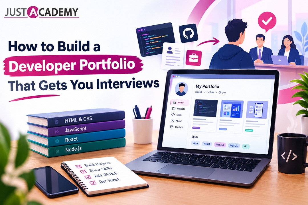
Your portfolio is the most important thing you will make in the first year of your career. Recruiters rarely have time for long biographies. They scan a page for thirty seconds, decide whether the thinking looks real, and either dig deeper or move on. So creating online portfolio pages that respect that thirty second window is a design problem in its own right, and you are the user researcher and the designer at the same time.
Lead With Thinking, Not Thumbnails
An online portfolio website full of glossy mockups and no explanation tells a hiring manager very little. What builds trust is the story underneath: who the users were, what you got wrong at first, which trade offs you made and why. A clear paragraph about a failed test is often more convincing than a perfect final screen, because it proves you can learn. If you want a practical walkthrough of structure and presentation, this guide on how to build a professional UI UX portfolio using Figma covers the essentials in a friendly way.
Structure Each Case Study Like a Short Film
Open with a one line summary of the problem and your role. Show the research quickly, with two or three insights that actually changed the design. Walk through key decisions with before and after screens. End with results, even if they come from a small test, and one honest reflection on what you would do differently. Keep each case study readable in about five minutes. A web portfolio is not a museum, and nobody wants to wander through it for an hour.
What Freshers Should Show When They Have No Clients
Do not wait for a client to make a portfolio. A design portfolio website for a fresher can be built from self initiated projects, redesigns with a clear reasoning, volunteer work for a local nonprofit or a college club, and collaborations with student developers. What matters is that each project has a real user, a real constraint and a visible process. Pretend clients are fine as long as you are honest about it and thoughtful in how you handle the brief.
Say Less, Show More, Then Ask for Feedback
Once a draft is ready, hand it to two people: a designer who can critique craft and a friend who has never heard of ux. The first will spot weak hierarchy. The second will tell you which sentence made no sense. Mentor led review sessions are especially helpful at this stage, because a good mentor has seen hundreds of portfolios and can spot in seconds the mistakes that would take you months to discover alone.
Portfolio Platforms and Ideas Worth Borrowing From
The next question is always where to host all this work. There are more portfolio creation websites than anyone can reasonably try, so it helps to sort them by what they do for you rather than by how pretty their templates look. Some are communities where designers share work and get discovered. Some are builders that give you full control over your own page. Some are simple document tools that are perfectly good when speed matters more than polish.
Communities such as Behance and Dribbble are excellent for visibility and inspiration, and many creative portfolio sites of this kind double as informal talent pools where recruiters browse. They are a fine place to post a summary, but they should point back to a fuller story on a page you own. For that page, a portfolio website maker such as Framer, Webflow, Squarespace or Wix gives you control over layout and speed, and each has a free or low cost starting point. A portfolio online maker is only as good as your content, so choose the one you can update in ten minutes rather than the one with the fanciest animation.
If you are short on time, a simple portfolio website built with a clean template and three strong case studies will outperform a complicated one that never launches. Even a well organised Notion page can serve as an early web portfolio while you build something bigger. Designers coming from other backgrounds sometimes browse graphic design portfolio sites and production design websites for layout ideas, which is a smart habit, because a grid used well in a film or print portfolio often translates beautifully to a screen.
A quick word on labels, because search results can confuse beginners. A portfolio website for designers is simply a home for your case studies, while a web design portfolio is the same idea for people who mostly build websites. Both need the same ingredients: a clear introduction, two or three deep projects and an easy way to get in touch. Do not let the name of the category push you into a complicated build.
Portfolio Web Ideas That Feel Human
Some portfolio web ideas cost nothing and change everything. Write your introduction in the voice you would use in a real conversation. Add a short section about how you work, including what you do when you disagree with a stakeholder. Show a rough sketch next to a final screen so visitors see your process. Record a two minute walkthrough of your best project, because a voice adds warmth that text cannot. When people browse a site design portfolio, they are quietly asking whether they would enjoy working with you, and small human touches answer that question.
Learning From Cool and Unique Examples
Spend an afternoon browsing cool portfolio websites and the best portfolio pages you can find, and take notes on what makes each memorable. You may notice that unique portfolio websites rarely rely on gimmicks. They usually have a strong point of view, a consistent visual voice and very clear navigation. A graphic designer web portfolio might lean on bold typography and large images, while a ux focused one leans on diagrams and written reasoning. Borrow the principle, never the layout, and let your own personality decide the rest.
Certificates, Bootcamps and Live Classes Compared Honestly
Beginners often ask which learning route is the best, and the truthful answer is that it depends on how you learn and how much accountability you need. Let us compare the common options without the sales gloss.
Many people begin with the google ux design certificate, a popular online programme that introduces the design process in a friendly way. It is a decent starting point for understanding vocabulary and workflow, and its low cost makes it easy to try. Its limits are the ones every self paced course shares: feedback is thin, projects can look alike across thousands of learners, and nobody chases you when motivation dips. If you take that route, treat it as a foundation and add live feedback on top.
Free video libraries and community tutorials are wonderful for curiosity and terrible for structure. You can learn any single technique from them, but stitching techniques into a coherent skill set takes a plan, and most people run out of steam somewhere around month two. Purely offline classroom courses give strong discipline, but for someone living in Pune they can mean long commutes, rigid timings and limited choice of instructors.
Live online training with an instructor and a mentor sits in a helpful middle position. You get a schedule, a peer group, real time feedback and personal guidance without crossing the city or the state. Before joining any course, though, do your homework. Ask who teaches, how many live hours you get, whether projects are reviewed individually and what support exists for portfolios and interviews. A short read on what to check before you join a Figma course can save you both money and months.
Whatever route you pick, judge it by outcomes you can see: a stronger portfolio, sharper explanations of your decisions and more confidence talking to developers and managers. Certificates are pleasant. Evidence of thinking is what gets you through the door.
Entry Level UX Designer Jobs and Where They Hide
Almost nobody finds entry level ux designer jobs by scrolling one job portal on a Sunday night. They appear in quieter places, so a smart search uses several channels at once.
Product Companies, Startups and Agencies
Product companies value depth and often hire juniors into structured design teams. Startups move faster and give you wide responsibility from day one, which can be thrilling or overwhelming depending on your temperament. A ui ux agency or a ui ux design studio works across many industries, so you meet a new problem every few weeks, and clients will teach you to explain decisions clearly, a skill that follows you everywhere. Pune has all three kinds, plus plenty of captive design teams inside larger technology firms.
Internships, Freelance Work and Referrals
Internships remain one of the most reliable doors, especially for career switchers. Small freelance projects are another. A local shop, a coaching class or a friend's startup often needs a website or app screens, and doing that work builds real evidence. Interestingly, local businesses frequently type ui ux designer near me into a search bar when they need help, so a clear portfolio page with your city and services listed can occasionally bring work to you. Referrals matter too. Attend design meetups, join online communities, comment thoughtfully on other designers' work and let people see how you think.
Writing an Application People Answer
Keep your message short and specific. Mention one thing you noticed about the company's product, link to the single case study most relevant to them and say what you would love to learn. Recruiters answer messages that feel written for them. They ignore templates that could have been sent to anyone. When you get an interview, expect a portfolio presentation, a discussion about process and sometimes a small design exercise. Practise all three aloud with a mentor until explaining your reasoning feels natural rather than rehearsed.
Designers Who Speak Developer Get Hired Faster
One quiet advantage many juniors overlook is the ability to talk to engineers without friction. You do not need to code. You do need to understand what is easy, what is costly and what is impossible on each platform, because a design that ignores those limits will be argued about for weeks. Curiosity about how products are built makes you a much better teammate, and hiring managers notice.
Cross Platform Products and Flutter
Many startups build one codebase that runs on both Android and iOS, and Flutter is a popular way to do it. Designers who understand how widgets, spacing and responsive layouts behave in such frameworks produce cleaner handoffs. If you are curious about what that side of the world looks like, a look at Flutter training in Pune shows how developers are taught to turn design files into real screens.
Native Android Thinking
Android has its own conventions for navigation, typography, motion and system behaviour, and users expect an app to follow them. Knowing that a back gesture, a bottom sheet or a notification behaves in a certain way helps you design screens that feel at home. Learning the developer view, even lightly through Android app development in Pune topics, makes your specifications sharper and your conversations shorter.
The Apple Ecosystem and Its Discipline
Apple platforms reward designers who respect detail. Safe areas, dynamic type, haptics and gesture patterns are part of what makes an iPhone app feel polished. Understanding how developers approach these constraints, perhaps by reading about iOS training in Pune and what it covers, will train you to design with the platform instead of against it.
Web Products and the Startup Stack
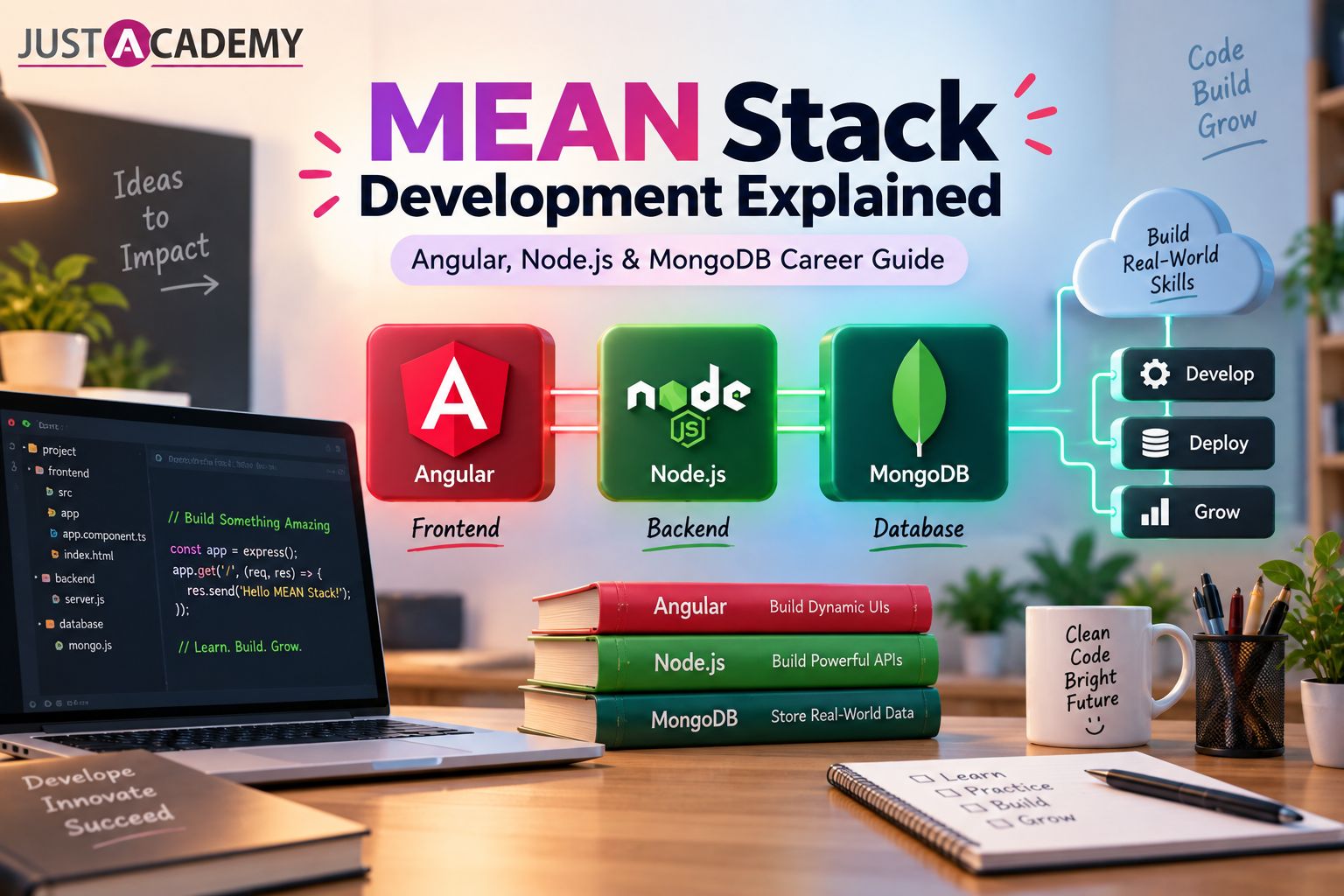
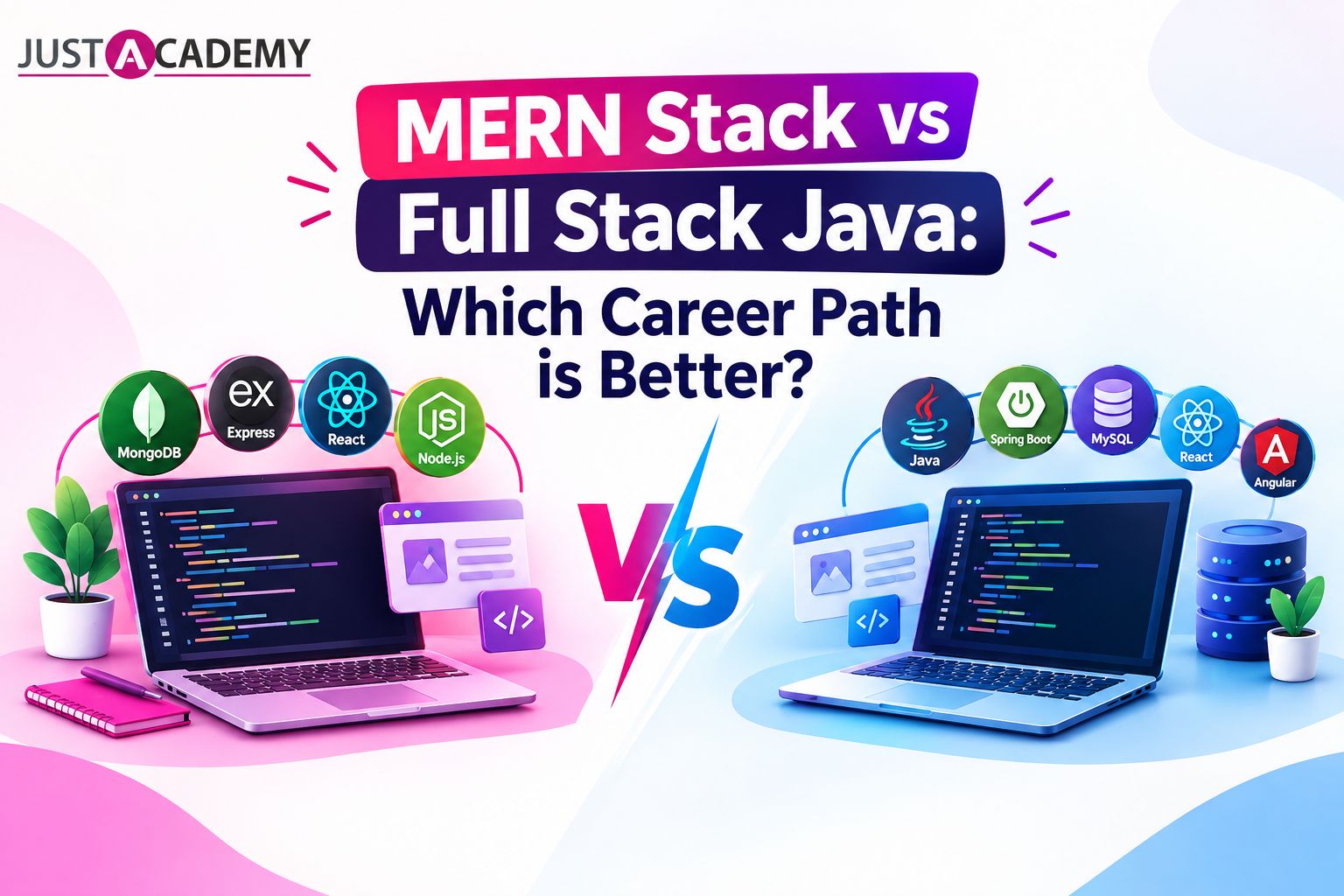
A large share of new products begin on the web, often built with the MERN stack of MongoDB, Express, React and Node. Designers who understand components in React find it easier to structure their own figma components the same way, which shortens handoff dramatically. If you want to see how product minded developers are trained, the MERN stack bootcamp in Pune focused on startup product development is a good window into that world, and a handy reminder of who you will be working beside.
Using AI Tools Without Losing Your Own Voice
Almost every design tool now offers some kind of assistant, and beginners often ask whether they should use it or avoid it. The sensible answer sits in the middle. Let a tool speed up the tedious parts, such as generating placeholder text, suggesting layout variations or tidying layer names, and keep the judgement for yourself. A generated screen can be a fine starting point for a conversation, but it cannot tell you why a real person in Pune would trust your product with their money.
Hiring managers are already good at spotting portfolios built entirely from generated output. Everything looks polished, and nothing feels considered. What stands out instead is your reasoning: the interview note that changed your navigation, the trade off you argued about with a developer, the small detail you fixed after watching someone struggle. Use assistants to save time, then spend the saved time on research and testing, which no tool can do for you.
This is another reason live, mentor led learning holds its value. A mentor can look at a screen you made with help from software and ask, calmly, what problem it solves and for whom. If you cannot answer, you have found the gap. If you can, you have just practised the exact kind of explanation that interviews demand. Treat every tool as a helpful colleague who occasionally talks too confidently, and keep your own voice in charge of the final call.
Small Habits That Quietly Separate Good Designers
Talent matters less than routine. The designers who grow fastest tend to share a handful of unglamorous habits, and you can begin practising every one of them this week.
They write down why they made a decision, even a small one, so that they can explain it later. They ask for critique early, when a design is still rough, instead of waiting until it feels safe. They keep a swipe file of interfaces that impressed them. They read the questions users leave in app store reviews, because those reviews are free research. They name layers properly in figma and keep their files tidy, which sounds boring until a teammate opens the file at eleven at night and thanks you silently.
They also protect their curiosity. Try a new tool once a month. Sit in on a developer's standup if you are allowed. Read one book on psychology or writing each quarter. Design draws on everything, and the people who stay interested in the world outside their screens usually design better screens.
Mistakes to Skip if You Can
Do not copy popular case studies pixel for pixel, because interviewers spot it immediately. Do not skip research and jump straight to visuals. Do not present a project without saying what you personally did. Do not chase every trending tool, and do not compare your first month to someone else's fifth year. Progress in design is quiet and cumulative, and it rewards steady people.
Questions Pune Beginners Keep Asking
Can I become a ui ux designer without a design degree?
Yes. Many working designers came from engineering, commerce, arts or media. What employers check is evidence of thinking, which lives in your portfolio and in how you explain your decisions, not in a certificate on the wall.
How long does it take to become job ready?
For most people studying steadily, around six months is realistic for a first portfolio and first interviews, though the exact pace depends on your hours and your feedback loop. Live guidance tends to shorten it, because mistakes get corrected quickly.
Do I need to learn coding as well?
Not compulsorily. A basic understanding of how web pages and apps work helps you collaborate, but you can build a fine career on design skills alone.
Is live online training really as good as sitting in a classroom?
For design, often yes. Screen sharing, real time feedback and recorded revision material work very naturally with a tool like figma. What matters more than the location is whether the sessions are genuinely interactive and whether a mentor reviews your work personally.
What should my first portfolio contain?
Two thoughtful case studies, one smaller exercise, a short introduction and a clear way to contact you. Quality of reasoning beats quantity of projects every time.
Your Next Step From Pune
Careers rarely begin with a grand decision. They begin with a small, slightly nervous step that you take before you feel ready. Maybe that step is opening figma tonight and redrawing one screen you love. Maybe it is writing three sentences about why an app frustrates you. Maybe it is asking a real person to look at your work and tell you the truth.
The road from curious beginner to working ui ux designer is not mysterious. It is a sequence of habits, projects and conversations, and the conversations are the part you should never try to skip. Learn from people who are ahead of you, build work that shows your thinking and keep your eyes on the humans behind every screen. Do that for six honest months and the design world in Pune will start feeling much less closed than it looks from the outside.
Ready to see how a live, instructor led and mentor led session actually feels? Register for a free demo and experience the teaching first hand, or download the brochure to explore course details at your own pace.
Why 2026 Is a Surprisingly Good Year to Begin
Figma Without the Marketing Noise
Building a Portfolio That Gets Opened, Not Just Bookmarked
Designers Who Speak Developer Get Hired Faster