A practical, project by project guide to turning scattered design work into a portfolio that actually gets you interviews
Why Your UI/UX Portfolio Matters More Than Your Resume Right Now
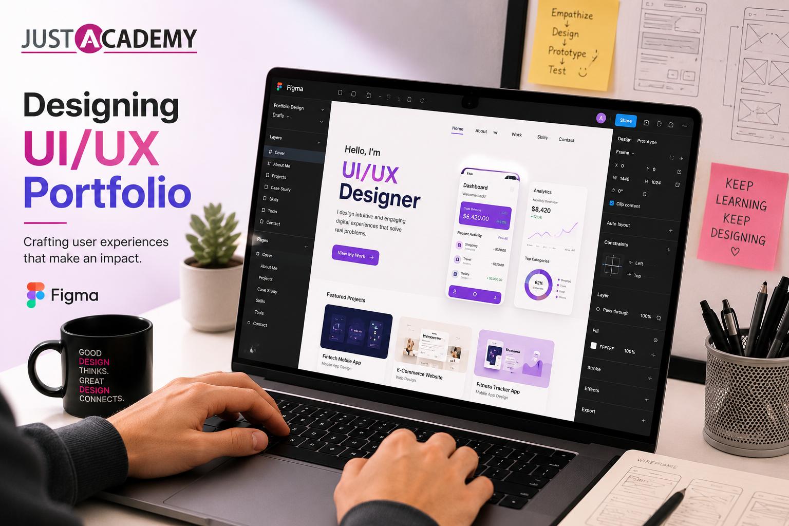
If you have ever spent an evening polishing your resume for a design role only to get zero replies, you already know something most job seekers figure out the hard way, nobody hires a UX designer based on a resume alone. What actually gets you shortlisted is a figma portfolio that shows a hiring manager exactly how you think, how you approach a messy problem, and how you turn that thinking into something a real user can actually use. Your resume tells someone you exist. Your portfolio tells them whether you can do the job.
This is exactly why so many talented beginners get overlooked while designers with far less raw skill land offers faster, the second group simply knows how to package their work. Building a genuinely strong ui ux portfolio is not about having a huge number of projects, it is about showing clear reasoning behind a handful of well documented ones. This blog walks through exactly how to build that portfolio inside Figma, from picking the right projects to writing case studies that actually hold someone's attention. If you would rather learn this whole process with guidance instead of piecing it together alone, the figma training program covers all of this in a structured format, and you can also register for a free demo class first to see how a live session actually feels before deciding anything.
There is also a quieter reason portfolios matter so much in this field specifically, compared to something like backend development where a resume full of technical keywords can carry more weight on its own. Design is fundamentally about communication and problem solving made visible, and the only real way to demonstrate that is by showing your actual thinking process, not describing it in bullet points. A resume can claim you understand user centered design. A well documented portfolio project proves it.
What Actually Makes a UI/UX Portfolio Stand Out
Before touching Figma at all, it helps to understand what separates a forgettable portfolio from one that gets remembered. Most beginner portfolios are just a gallery of pretty screens with no context. A hiring manager looks at ten of these a day and forgets all of them by lunchtime. What sticks is a portfolio that explains the problem behind each screen, the constraints you were working within, the decisions you made, and why.
This is where a lot of self taught designers stumble, not because their design work is weak, but because they present it like a gallery instead of a case study. Fixing that single habit does more for your job search than adding five more shallow projects ever could.
It also helps to think about your portfolio the way a hiring manager actually experiences it, not the way you experience it while building it. You know every decision behind every pixel because you lived through the process. A stranger opening your portfolio for the first time knows none of that context, which means your job is not just to show good design, it is to reconstruct enough of your thinking that a complete outsider can follow along and trust that you understood the problem before you started solving it.
Building a Figma Portfolio Step by Step
Choosing Projects Worth Documenting
Not every project deserves a spot in your portfolio. Pick three to five pieces of work that each demonstrate a different skill, one focused on user research and wireframing, one on a complex interaction pattern, one on responsive design across devices, and one on visual polish and a design system. Quality and variety beat quantity every single time.
If you are still early in your design journey and worried you do not have enough real work to choose from, that is completely normal and solvable. Take on redesign projects for apps you use daily, identify a genuine usability problem, and solve it properly rather than just making it look different. Redesigns done thoughtfully, with a clear before and after narrative, carry just as much weight as client work when you are early in your career.
Try to include at least one project that reflects mobile app design specifically, since so much hiring right now leans toward designers who can think natively about smaller screens rather than simply shrinking a desktop layout down. Alongside that, keep at least one project rooted in more traditional website ui design, since plenty of roles, particularly at established companies, still involve substantial desktop and web based product work.
Wireframing Before You Touch Colors
A mistake almost every beginner makes is jumping straight into high fidelity screens before nailing down the actual structure of an experience. Spend real time in Figma's basic shapes and frames building low fidelity wireframes first. This stage is where you are solving layout, hierarchy, and flow problems, not aesthetic ones, and skipping it usually means redoing your high fidelity screens later once you realize the structure underneath was never quite right.
Document this stage in your case study too. Showing a rough wireframe next to your polished final screen, with a short explanation of what changed and why, is exactly the kind of process transparency that separates a genuinely useful portfolio from one that just shows finished output with no story behind it.
This is also the stage where design thinking methodology actually earns its place in your process rather than sitting as a phrase you learned in a course. Empathize with the user's actual problem, define it clearly, generate more solution ideas than you think you need, prototype the strongest one, and test it against real feedback where possible. Walking through even a simplified version of this cycle in your case study, rather than jumping straight from problem statement to finished screen, shows a reviewer that your process has real structure behind it, not just intuition.
If you are trying to figure out what genuinely good wireframing and structure look like in practice, this breakdown of a few standout Figma classes in Mumbai built entirely around live client projects and placement outcomes is a useful read, since it walks through how a structured program actually paces this exact stage alongside real project briefs rather than isolated exercises.
Moving Into Prototyping
Once your wireframes feel solid, Figma's prototyping tools let you connect screens together into something a reviewer can actually click through rather than just look at. This matters enormously for interaction heavy projects, a checkout flow, a multi step onboarding sequence, anything where the transitions and micro interactions are part of the actual design decision, not just decoration.
There is a genuinely useful, honest breakdown of exactly which parts of Figma beginners should prioritize learning first, and which advanced features are worth skipping until later, in this guide covering what to actually know before committing to any figma course, which is worth reading before you invest serious time chasing every single feature the tool offers.
It is worth mentioning here that prototyping is also where a lot of beginners either lean too hard into complexity or avoid it entirely. Overloading every screen transition with elaborate animation can distract from the actual usability story you are trying to tell, while skipping prototyping altogether leaves your portfolio feeling static and disconnected from how a real user would actually move through the experience. Aim for prototypes that feel purposeful, enough interactivity to demonstrate the flow clearly, without turning every case study into an animation showcase that overshadows the underlying design decisions.
Writing Case Studies That People Actually Read
This is the single most underrated skill in the entire UX portfolio building process. A polished screen with no explanation is decoration. A polished screen paired with a clear, honest case study describing the problem, your research, the constraints, and your reasoning is proof you can think like a designer, not just operate design software.
Structure each case study around a simple arc, the problem you were solving, who the user was, what constraints you were working within, the decisions you made and why, and what the outcome was, even if the outcome is simply "here is what I learned." Keep the writing conversational rather than overly formal, hiring managers read dozens of these and the ones that sound like an actual person talking through their thinking tend to stick far longer than ones written like a corporate report.
Length matters here too, though not in the way most beginners assume. A case study does not need to be exhaustive, it needs to be complete. A tightly written explanation covering the key decisions in a few clear paragraphs, supported by well chosen visuals at each stage, almost always outperforms a sprawling ten screen breakdown that repeats the same point three different ways. If you find yourself writing paragraph after paragraph justifying a single button placement, that is usually a sign to trim rather than a sign of thoroughness.
Adding Responsive Design Thinking
Modern hiring managers expect to see that you understand how a design adapts across screen sizes, not just how it looks on a single desktop mockup. Pick at least one project in your portfolio and show it across mobile, tablet, and desktop breakpoints, with a brief explanation of what changed structurally between them and why. This single addition signals a level of practical thinking that a lot of beginner portfolios completely skip.
Responsive thinking also connects directly to how well your designs hold up once they reach actual development. A layout that only ever gets tested at one fixed screen width tends to reveal awkward gaps and overflow problems the moment a developer builds it across real devices. Designers who think in flexible grids and adaptable components from the start, rather than pixel perfect fixed layouts, tend to have noticeably smoother handoff conversations with their development teams later on.
UI/UX Portfolio Projects for Beginners That Actually Get Noticed
If you are staring at a blank Figma file wondering where to even start, here are project types that consistently work well for beginners building their first serious portfolio.
A food delivery app redesign gives you room to demonstrate complex information hierarchy, filtering, and a multi step checkout flow. A fitness or habit tracking app lets you show off data visualization and motivational micro interactions. A local small business website redesign, ideally for a real business you know personally, gives your case study genuine stakes and a real client conversation to describe. And a simple internal dashboard design demonstrates that you can handle dense information without overwhelming a user, a skill many junior designers never get to practice until their first job.
Pick projects that genuinely interest you rather than whatever seems most impressive on paper. Portfolios built around topics you actually care about tend to include sharper thinking and more thorough case studies, simply because you stayed engaged with the problem longer than you would have with something you picked purely to look good on a resume.
A quiet but important tip here, avoid picking four projects that all solve essentially the same type of problem. A portfolio with four different food delivery app redesigns tells a reviewer far less about your range than one project each covering an app, a dashboard, a website, and a small business redesign. Variety in problem type matters just as much as variety in visual style when it comes to demonstrating that you can adapt your thinking to different contexts rather than repeating one comfortable pattern.
Where to Host Your UX Portfolio Website
Once your case studies are written and your Figma files are polished, you need somewhere for people to actually see them. A dedicated ux portfolio website gives you far more control over storytelling than relying purely on a design community profile, though maintaining a presence on platforms designers already browse regularly is still worth doing alongside your own site.
If building a website from scratch feels intimidating, there are genuinely solid free ux portfolio website builders designed specifically for designers that let you focus entirely on content rather than fighting with code. Whichever option you choose, keep the navigation simple, lead with your strongest project first, and make sure every case study is easy to scan even for someone spending less than two minutes on your site, since that is the reality of how most hiring managers first browse a portfolio.
A small but genuinely important detail many beginners overlook is making sure your portfolio itself demonstrates decent UI sensibility, not just the projects inside it. If your case studies contain thoughtful, well structured design work, but the portfolio website hosting them feels cluttered or inconsistent, that mismatch quietly undermines the credibility of everything else. Treat your own portfolio website for ui ux designer as one more design project worth the same level of care you gave to everything inside it.
How Design Skills Connect to the Development Side
Something a lot of aspiring UX designers underestimate is how much smoother their handoff process becomes once they understand at least the basics of how developers actually build what they design. You do not need to become a developer yourself, but spending even a little time understanding how a framework like React structures components, or how a MERN stack development bootcamp approaches building an application end to end, changes how you design. You start designing with implementation realities in mind rather than handing developers screens that look perfect but are genuinely painful to build.
The same logic applies if your portfolio leans toward mobile app design specifically. Understanding how something like Flutter actually renders UI components can help you design more consistent, buildable mobile interfaces, since you start thinking in terms of reusable components rather than one off custom screens for every single situation. None of this needs to be a deep technical skill, even a surface level understanding meaningfully improves how well your designs translate into working products.
Designers who eventually want to move toward more product focused or even hybrid design engineering roles sometimes go a step further and explore full stack development concepts directly, which is where a structured MERN stack path becomes genuinely useful, not to replace design skills, but to add a layer of technical fluency that makes cross functional collaboration considerably smoother. You do not need to pursue this route to build a strong portfolio, but it is worth knowing it exists as a natural next step for designers who find themselves increasingly curious about the engineering side of the products they design.
Staying Current With Where the Industry Is Actually Heading
Design trends shift constantly, and while chasing every micro trend is a waste of energy, staying aware of where the broader industry is genuinely moving helps you make smarter, more durable decisions in your portfolio work. There is a genuinely thorough breakdown of what is actually shaping design decisions across the industry right now, rather than just recycled predictions, in this look at the ui ux design trends worth understanding in 2026, worth reading once your core portfolio projects are in place and you are deciding what to build next.
That said, treat trend awareness as context rather than a checklist to force into every project. A portfolio full of trendy visual effects with no genuine problem solving behind them reads as shallow the moment a reviewer looks past the surface. The strongest approach is understanding where the industry is heading broadly, then applying that awareness selectively, in the one or two projects where a current pattern genuinely serves the user's actual needs rather than existing purely for visual novelty.
Common Mistakes That Quietly Weaken a Portfolio
A handful of habits show up repeatedly in beginner portfolios, worth naming directly so you can avoid them. The first is including too many projects, diluting your best work among mediocre filler pieces instead of letting your strongest three or four projects genuinely shine. The second is skipping the process entirely and showing only polished final screens, which makes it impossible for a reviewer to judge your actual thinking rather than just your visual taste.
The third, and one of the most common, is writing case studies that read like a resume bullet list rather than an actual narrative, listing tools and steps without ever explaining the reasoning behind the decisions made along the way. Fixing this single habit, writing like you are explaining your thinking to a curious colleague rather than filling out a form, does more for your portfolio's impact than any additional visual polish ever could.
A fourth mistake worth naming is neglecting to update a portfolio once it goes live. Treating it as a one time project rather than an evolving body of work means it quietly ages, both visually and in terms of what it says about your current skill level. Set a habit of revisiting your portfolio every few months, swapping out your weakest project for something stronger as your skills grow, and refreshing your case study writing as your ability to explain your process improves over time.
Why Structured Training Changes How Fast Your Portfolio Comes Together
Here is something worth being honest about. Self teaching Figma and UX design is absolutely possible, plenty of working designers got here exactly that way. But it usually takes considerably longer, and involves a fair amount of trial and error that a good mentor could shortcut significantly, especially around design thinking methodology and how to actually structure a compelling case study rather than just making screens look nice.
As an ISO certified institute with classroom presence across Mumbai and Pune, and live interactive sessions available to learners anywhere in the world, JustAcademy's approach centers around exactly the process covered in this blog, wireframing, prototyping, real project work, and genuine portfolio building, with an instructor available to give feedback before bad habits settle in over months of solo learning.
Learners working through the program work through real client style briefs rather than generic exercises, and get placement support built directly into the course.
Because live interactive training means your case studies get reviewed by someone who has actually hired designers before, not just a generic feedback checklist, and because placement support means your job search does not start completely from zero the moment your portfolio is ready. For learners weighing a ui ux design course in mumbai against teaching themselves entirely, that structured feedback loop tends to be the single biggest factor in how quickly a portfolio actually becomes interview ready rather than sitting unfinished for months.
Choosing between JustAcademy's Mumbai classroom batches and the live interactive online sessions usually comes down to personal preference rather than any real gap in quality, both formats cover the same curriculum, the same project briefs, and the same mentor access, the only real difference is whether you prefer learning alongside people in the same room or joining from wherever you happen to be. Either way, the goal remains the same, walking away with a portfolio you are genuinely proud to show, not just a certificate confirming you attended.
Conclusion
A strong UI/UX portfolio is not built by accumulating dozens of pretty screens, it is built by documenting a handful of real projects thoughtfully, showing your thinking as clearly as your visuals, and presenting it all somewhere a hiring manager can browse in under two minutes and walk away impressed. Figma gives you every tool you need to build that portfolio, wireframing, prototyping, and clean visual design, but the tool alone will not write your case studies or make the hard decisions about which projects deserve a spot.
Whether you choose to build this skill set independently or through a guided ui ux design course in mumbai, what actually determines your outcome is consistency, honest documentation of your process, and a willingness to treat your portfolio as an ongoing project rather than something you finish once and never touch again.
A portfolio built this way, project by project, with genuine reasoning behind every decision, does something a resume simply cannot, it lets a hiring manager experience a small piece of what it would actually be like to work with you. That is the entire point of building one properly rather than rushing through it just to check a box before applying to jobs.
If you are ready to turn scattered design work into an actual portfolio with mentor feedback, real project briefs, and placement assistance behind you, JustAcademy's figma training is built exactly for that path, with both Mumbai classroom options and live interactive online sessions for learners anywhere. Register for your free demo class today to see the curriculum in action, or if you would rather review the details first, download the complete brochure and plan your next move at your own pace.
Why Your UI/UX Portfolio Matters More Than Your Resume Right Now
Building a Figma Portfolio Step by Step
UI/UX Portfolio Projects for Beginners That Actually Get Noticed
Why Structured Training Changes How Fast Your Portfolio Comes Together