I am learning flutter from JustAcademy, They provide very much great environment where people gather and work simultaneously. totally project based training institute.
MOHD ABU BAKAR ANSARI
Flutter Developer
Awesome Experience. I am a Front-end Web Designer working at Star India for 3 years now. I applied for Full-stack development and my experience has been phenomenal & they really do help with placements exceptionally. Thank you Roshan sir so much.
Data visualization is the bridge between raw analytical work and the business decisions that data is meant to support. An analyst who can extract profound insights from a dataset but cannot communicate those insights clearly through well-designed charts, dashboards, and reports is only doing half the job. The best data visualization tools in 2026 allow analysts to present complex findings in formats that non-technical stakeholders can understand, evaluate, and act on quickly and confidently.
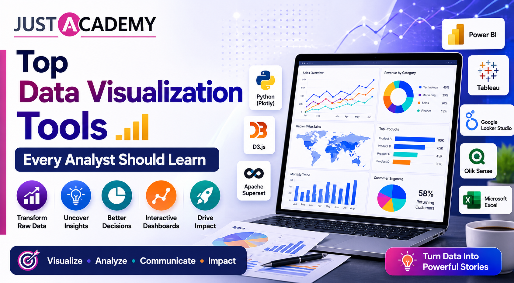
The landscape of data visualization tools has expanded significantly and knowing which tools to learn, in what order, and why each one matters for specific career paths is one of the most important decisions a data analyst can make. This blog covers the top tools for data visualization in 2026 that every analyst should know, from enterprise BI platforms like Tableau, Power BI, and Looker Studio to Python-based visualization libraries and emerging AI-assisted tools. It explains what each tool does, where it is used, what it pays, and how to prioritize your learning based on your career goals and target industry. Whether you are preparing through the best data visualization course in Mumbai or through a live interactive online analytics training program, this guide gives you a complete and practical picture of the visualization tool landscape in 2026.
Why Data Visualization Is One of the Most In-Demand Analyst Skills in 2026
The Gap Between Data and Decisions
Organizations in India and globally are generating more data than ever before. The challenge is not data availability. It is the ability to make that data comprehensible and actionable for the people who need to make decisions based on it. A finance director cannot act on a raw SQL query result. A marketing manager cannot optimize a campaign based on a Pandas DataFrame. A hospital administrator cannot allocate resources based on a Python dictionary. Every piece of analysis ultimately needs to be communicated through visual formats that make patterns, trends, outliers, and relationships immediately apparent to the decision maker.
Data visualization is the skill that closes this gap. Analysts who can translate complex findings into clear, well-designed, interactive visual outputs are the ones whose work actually influences decisions rather than sitting in reports that nobody reads.
Employers Are Screening for Visualization Tool Proficiency
In 2026, data analyst job postings in India consistently list proficiency in at least one major BI tool as a required qualification. Power BI is mentioned in the majority of postings across banking, consulting, manufacturing, and enterprise software. Tableau appears frequently in technology, consulting, and healthcare roles. Looker Studio appears in digital marketing and e-commerce roles. Python visualization libraries appear in data science-adjacent and product analytics roles. Candidates who cannot demonstrate hands-on proficiency with at least one of these tools are filtered out at the screening stage regardless of their SQL or Python skills.
Visualization Affects Salary Directly
Analysts who combine strong technical data skills with the ability to build polished, insightful dashboards and reports consistently command higher salaries than those with equivalent technical skills but weak visualization capabilities. Power BI and Tableau proficiency each carry salary premiums of ten to eighteen percent above the average for data analysts within their experience band in India in 2026. This premium reflects the genuine difficulty of building dashboards that are not just technically correct but genuinely useful, readable, and well-designed.
AI Is Augmenting But Not Replacing Visualization Skills
AI-assisted features in tools like Power BI Copilot, Tableau AI, and Looker Studio are making it faster to generate initial visualizations but they are not replacing the judgment, design sense, and business context that skilled analysts bring to visualization work. An AI can suggest a chart type but it cannot determine which three metrics matter most to a specific executive, how to frame a finding to drive a specific business decision, or what level of detail is appropriate for the audience. These judgments remain human and remain central to the value an analyst provides.
Top Data Visualization Tools Every Analyst Should Learn in 2026
Microsoft Power BI
What It Is and Why It Dominates the Indian Market
Microsoft Power BI is the most widely used business intelligence and data visualization tool in India in 2026. Its deep integration with the Microsoft ecosystem including Excel, Azure, SharePoint, Teams, and SQL Server makes it the default choice for the majority of Indian enterprises, banks, insurance companies, manufacturing organizations, consulting firms, and government institutions. The annual cost of Power BI Pro licenses is significantly lower than Tableau, making it the practical choice for cost-conscious organizations with large user bases.
Power BI allows analysts to connect to dozens of data sources, transform and model data using Power Query and DAX, build interactive dashboards with slicers, drill-throughs, and bookmarks, publish reports to the Power BI Service for sharing and collaboration, set up scheduled data refresh, configure row-level security for different user groups, and now use Copilot AI to accelerate report development through natural language.
Who Uses It and Where
Power BI is used across virtually every industry in India. Banking and financial services organizations use it for branch performance dashboards, risk reporting, and customer analytics. Manufacturing companies use it for production efficiency, quality control, and supply chain dashboards. Consulting firms use it for client-facing analytical deliverables. Healthcare organizations use it for clinical and operational dashboards. It is the most broadly applicable visualization tool for the Indian job market in 2026.
Key Skills to Master in Power BI
Skill
Why It Matters
Data modeling with star schema
Foundation of all accurate Power BI reporting
DAX measures and calculated columns
Core of custom metric creation
Power Query transformations
Data cleaning and preparation within Power BI
Interactive dashboard design
Creating user-friendly reports with slicers and drill-throughs
Row-level security
Restricting data access by user role
Power BI Service publishing and sharing
Distributing reports across organizations
Copilot AI integration
Accelerating report development in 2026
Salary Premium and Career Impact
Power BI proficiency at an advanced level carries a salary premium of twelve to eighteen percent above the average for data analysts in India. The Microsoft PL-300 Power BI Data Analyst certification is one of the highest-value tool-specific credentials for the Indian analytics job market in 2026.
Tableau is one of the most powerful and visually sophisticated data visualization platforms available and has been a leader in the BI market since its release in 2003. Its drag-and-drop interface allows analysts to build complex, visually rich dashboards and charts without writing code, while its underlying VizQL engine provides flexibility for advanced analytics. Tableau Desktop is used for building workbooks and Tableau Server or Tableau Cloud for sharing and collaboration.
Tableau is particularly strong for exploratory visual analysis, where analysts want to rapidly explore a dataset by dragging dimensions and measures onto the canvas and instantly seeing different chart types. Its integration with Salesforce Einstein Analytics and the broader Salesforce ecosystem makes it dominant at organizations using Salesforce CRM.
Who Uses It and Where
Tableau is most commonly used at technology companies, consulting firms, healthcare organizations, and any organization where Salesforce is the CRM platform. In India, Tableau is particularly prevalent in the consulting and professional services sector, at technology product companies, and at organizations with sophisticated analytics teams that prioritize visual depth over ease of deployment. Global companies with India development centers including McKinsey, Deloitte, Accenture, and major technology firms use Tableau extensively.
Key Skills to Master in Tableau
Skill
Why It Matters
Calculated fields and table calculations
Creating custom metrics and percentages
Level of Detail expressions
Precise control over aggregation level
Dashboard design and interactivity
Filters, actions, and parameter controls
Tableau Prep for data preparation
Cleaning and shaping data before visualization
Sets and groups
Advanced segmentation for complex analyses
Tableau AI features
Automated insight discovery and natural language querying
Tableau Public
Hosting and sharing public portfolio visualizations
Salary Premium and Career Impact
Tableau proficiency commands a salary premium of ten to sixteen percent above average for data analysts in India. The Tableau Desktop Specialist and Tableau Certified Data Analyst credentials are recognized by employers at technology and consulting firms. Tableau Public, the free hosted version, is widely used for portfolio visualization projects.
For learners who want dedicated Tableau training, JustAcademy offers Tableau Training in Mumbai and Tableau Online Training covering all major Tableau skills from beginner to advanced dashboard design.
Google Looker Studio
What It Is and Why It Is Growing Rapidly
Google Looker Studio, formerly known as Google Data Studio, is a free web-based data visualization and reporting tool that connects natively to Google's ecosystem of products including Google Analytics, Google Ads, Google Sheets, BigQuery, and Search Console. It is the most accessible entry-level visualization tool available because it requires no software installation, no licensing cost, and has a relatively gentle learning curve.
In 2026, Looker Studio is widely used by digital marketing analysts, e-commerce teams, content marketers, and smaller organizations that need dashboards connected to Google's advertising and analytics platforms. Its native integration with BigQuery makes it a natural choice for organizations that use Google Cloud as their data platform.
Who Uses It and Where
Looker Studio is most commonly used at digital marketing agencies, e-commerce companies, startups, and organizations whose primary data sources are Google products. Marketing analysts who need to report on campaign performance across Google Ads, Facebook Ads, and website analytics frequently use Looker Studio for its pre-built connectors. It is also increasingly used at larger organizations for marketing analytics dashboards alongside Power BI or Tableau for operational and financial reporting.
Key Skills to Master in Looker Studio
Skill
Why It Matters
Google Analytics 4 integration
Most common data source for marketing dashboards
Custom calculated metrics
Creating derived KPIs beyond default metrics
Blending data from multiple sources
Combining Google Ads and GA4 data in one report
BigQuery connection
Querying large datasets directly in Looker Studio
Report sharing and scheduling
Distributing reports to stakeholders automatically
Community connectors
Connecting to non-Google data sources
Salary Premium and Career Impact
Looker Studio expertise is particularly valuable for roles in digital marketing analytics, e-commerce analytics, and growth analytics at startups and digital-first organizations. While it does not command the same premium as Power BI or Tableau in traditional enterprise roles, it is a highly sought-after skill for the growing digital marketing analytics job category in India.
Python Visualization Libraries
Why Python Visualization Matters for Analysts
Python-based visualization is essential for analysts who work primarily in code-based analytical environments rather than BI tools. Python's visualization libraries offer far greater flexibility and customization than drag-and-drop BI tools and are the standard approach for publishing charts in Jupyter notebooks, generating visualizations programmatically in data pipelines, and creating custom interactive visualizations for web applications. For analysts in technology companies, data science-adjacent roles, and research environments, Python visualization is a core daily skill.
Matplotlib
Matplotlib is the foundational Python visualization library that provides low-level control over every element of a chart including axes, labels, colors, line styles, and annotations. It is the basis on which most other Python visualization libraries are built. While Matplotlib requires more code than higher-level libraries for common chart types, it provides the maximum control needed for publication-quality custom visualizations. Every Python analyst should understand Matplotlib fundamentals even if they primarily use higher-level libraries for day-to-day work.
Seaborn
Seaborn is built on top of Matplotlib and provides a higher-level interface for creating statistically-focused visualizations with attractive default aesthetics and built-in support for common analytical charts including distribution plots, regression plots, heatmaps, pair plots, and categorical plots. Seaborn is the most commonly used Python visualization library for exploratory data analysis because it produces informative statistical charts with minimal code. Its tight integration with Pandas DataFrames makes it the natural choice for visualization during data analysis workflows.
Plotly and Plotly Express
Plotly is a Python library for creating interactive charts that can be embedded in Jupyter notebooks, web applications, and dashboards. Unlike Matplotlib and Seaborn which produce static images, Plotly charts support hover tooltips, zoom, pan, and click interactions. Plotly Express provides a simplified high-level interface for creating the most common chart types with minimal code. Plotly is the foundation of Dash, a Python framework for building analytical web applications and dashboards that can be deployed as standalone data products.
Key Python Visualization Skills for Analysts
Library
Best Use Case
Complexity
Matplotlib
Custom publication-quality static charts
Medium to High
Seaborn
Statistical exploratory data analysis
Low to Medium
Plotly Express
Quick interactive charts and notebooks
Low
Plotly full
Complex interactive dashboard components
Medium to High
Dash
Analytical web application dashboards
High
Folium
Geographic and map-based visualizations
Medium
For learners who want to master Python visualization as part of a complete analytics skill set, JustAcademy offers Python Training in Mumbai and Python Online Training covering Pandas, Matplotlib, Seaborn, and Plotly within a comprehensive analytics curriculum.
Microsoft Excel for Visualization
Why Excel Visualization Still Matters
Despite the availability of sophisticated BI tools, Excel remains a critical visualization platform in 2026 for the majority of analyst roles across banking, consulting, insurance, and operations-heavy industries. Many stakeholders prefer to receive Excel files they can interact with rather than web-based dashboards. Excel charts, pivot charts, dynamic dashboards using slicers, conditional formatting heat maps, and sparklines remain standard outputs in countless analyst workflows.
The key Excel visualization skills for analysts in 2026 include building dynamic charts linked to pivot tables, using slicers and timelines to make Excel dashboards interactive, applying conditional formatting to create heat maps and highlight key values, using sparklines for inline trend visualization, and leveraging Power Query and Power Pivot within Excel for more sophisticated data modeling that powers richer visualizations.
Apache Superset
What It Is and Why It Is Growing in Popularity
Apache Superset is an open-source business intelligence and data visualization platform that has gained significant traction in India in 2026 particularly at technology companies and startups that want enterprise-grade BI capabilities without the licensing costs of Tableau or Power BI. It connects to a wide range of databases and data warehouses including PostgreSQL, MySQL, BigQuery, Snowflake, and Redshift, and provides a rich library of chart types with a drag-and-drop dashboard builder.
Superset is particularly valued in organizations with strong data engineering practices because it integrates well with modern data stacks including dbt, Airflow, and cloud data warehouses. Analysts and analytics engineers who know Superset are increasingly sought after at technology companies and data-mature organizations in India.
Qlik Sense
What It Is and Who Uses It
Qlik Sense is an enterprise BI platform that uses an associative data model, which allows users to explore relationships between data freely without being constrained to predefined hierarchies. Its in-memory data engine enables fast, responsive analysis of large datasets. Qlik Sense is used at large enterprises particularly in manufacturing, retail, and financial services where complex multi-dimensional data exploration is required. While less prevalent than Power BI or Tableau in the Indian market, Qlik skills are valued at specific large enterprise employers and command strong salaries.
Emerging AI-Assisted Visualization Tools
Tools That Are Changing the Visualization Landscape
Several AI-assisted tools are changing how analysts create and interact with visualizations in 2026. Microsoft Power BI Copilot generates complete report pages from natural language descriptions. Tableau AI surfaces automated insights from connected datasets. ThoughtSpot uses natural language querying to allow business users to ask questions in plain English and receive instant visual answers. Obviously AI and similar AutoML platforms generate predictive visualizations automatically. Analysts who understand both traditional BI tool skills and how to work effectively with these AI-assisted features are the most competitive in the 2026 job market.
Data Visualization Tool Comparison for Indian Analysts
Tool
Cost
Best For
India Market Demand
Learning Curve
Power BI
Paid with free tier
Enterprise BI across all industries
Very High
Medium
Tableau
Paid with public free version
Deep visual analysis and consulting
High
Medium to High
Looker Studio
Free
Marketing and Google ecosystem analytics
High in digital roles
Low
Python Matplotlib
Free
Custom programmatic visualizations
High in tech roles
Medium to High
Python Seaborn
Free
Statistical exploratory analysis
High in analytics roles
Low to Medium
Plotly and Dash
Free and paid
Interactive notebooks and web apps
Growing
Medium
Excel Charts
Included in Office
Traditional reporting across industries
Very High
Low to Medium
Apache Superset
Free open source
Tech startups and data-mature organizations
Growing
Medium
Qlik Sense
Paid
Large enterprise complex analysis
Moderate
High
How to Choose the Right Data Visualization Tool for Your Career Goals
If You Are a Fresher With No Prior Analytics Experience
Start with Power BI. It is the most in-demand visualization tool in the Indian job market, has a clear learning path, and is used across the widest range of industries. Learning Power BI gives you the broadest employability from the earliest stage of your career. After establishing Power BI proficiency, add Excel visualization skills as they complement Power BI in most enterprise environments. Looker Studio is a quick addition that requires minimal learning time and opens digital marketing analytics roles.
If You Are Targeting Technology Companies and Product Roles
Prioritize Python visualization with Seaborn and Plotly alongside SQL. Technology companies and product analytics teams prefer code-based analytical workflows over drag-and-drop BI tools. Add Tableau or Looker Studio as your secondary BI tool depending on the specific companies you are targeting. A combination of Python visualization and one BI tool is the standard profile for product analytics roles at Indian technology companies in 2026.
If You Are Targeting Consulting and Financial Services
Power BI and Tableau together are the strongest combination for consulting and financial services. Power BI is widely used for client deliverables and internal reporting at consulting firms. Tableau is used by top-tier strategy consulting firms and financial institutions with sophisticated analytics practices. Excel visualization skills remain essential at all levels in both sectors. Developing deep proficiency in both Power BI and Tableau makes you exceptionally competitive in these industries.
If You Are Already Working and Looking to Upskill
Identify which visualization tool your current employer and target employers use most. Deepen your proficiency in that tool first by working toward certification. Then add a complementary tool based on the direction you want to grow. If you are a Power BI user targeting more technical roles, adding Python visualization is a high-impact next step. If you are a Python analyst wanting to improve business communication, adding Power BI or Tableau dramatically increases the range of audiences you can serve.
How to Build Data Visualization Skills With the Best Training in 2026
Practice Beats Theory Every Time
Data visualization is a skill that improves through practice far more than through theory. The best way to develop visualization proficiency is to regularly take datasets, define a business question, and challenge yourself to communicate the answer as clearly and as visually effectively as possible using your chosen tools. Critique your own work honestly. Show it to people who are not analysts and ask if they can understand it without explanation. Iterate based on their feedback. This cycle of practice, critique, and iteration is how visualization judgment is developed.
Build a Visualization Portfolio
Every data analyst should have at least two or three visualization projects in their portfolio that demonstrate their ability to work with real data and communicate findings clearly. For Power BI, publish interactive reports using publicly available datasets and include screenshots in your GitHub README. For Tableau, publish workbooks to Tableau Public and link to them from your portfolio. For Python, share Jupyter notebooks with well-formatted Seaborn and Plotly charts. These portfolio pieces are the most convincing evidence of visualization skill in any interview process.
Why Structured Training With Live Interactive Sessions Produces Better Outcomes
Data visualization tools like Power BI and Tableau have depth that is difficult to develop through self-study because many advanced features are only discovered when you encounter specific business requirements that demand them. Structured training exposes you to the full range of tool capabilities in a systematic sequence, ensures you build on fundamentals before attempting advanced features, and provides immediate feedback on your dashboard design decisions from instructors who have built real-world dashboards for real organizations.
Live interactive sessions are particularly valuable for visualization training because you can ask in real time why a specific approach produces a better outcome than an alternative, get feedback on whether your chart choice is appropriate for your data, and learn from seeing how an experienced analyst approaches a visualization problem from scratch.
JustAcademy's bootcamp programs integrate data visualization with Power BI, Tableau, and Python into a comprehensive analytics curriculum that includes real-world dashboard projects, live interactive classroom and online sessions, and placement support that connects your skills to employers across India and globally.
For learners in Maharashtra, the Data Analytics Bootcamp in Mumbai provides live interactive classroom training with real dataset projects and local industry connections recognized as one of the best data analytics courses in Mumbai for building job-ready visualization skills. For learners anywhere in India or globally, the Data Analytics Bootcamp Online delivers the same quality of live interactive sessions and project feedback from any location.
For learners who want dedicated training in specific visualization tools, JustAcademy also offers standalone programs:
Related Courses to Strengthen Your Complete Analytics Profile
Building skills beyond visualization into the full analytics stack makes you a more complete and competitive analyst. Explore these programs at JustAcademy:
The best data visualization tools in 2026 are not interchangeable. Each serves a distinct set of use cases, industries, and career paths. Power BI is the highest-priority tool for the broadest range of Indian analyst roles and should be the first BI tool any fresher learns. Tableau offers deeper visual capabilities and is essential for consulting, technology, and healthcare analytics roles. Looker Studio is the go-to for digital marketing and Google ecosystem analytics. Python visualization libraries are indispensable for analysts in technical, product, and data science-adjacent environments. Excel visualization remains a daily reality across banking, consulting, and enterprise organizations.
The right combination depends on your background, target industry, and career goals. But whichever tools you prioritize, the pattern is consistent. Analysts who invest in building genuine, demonstrable visualization proficiency, complete with portfolio projects, certification preparation, and the ability to explain their design decisions, consistently outperform those with equivalent technical skills but weaker visualization capabilities in both interviews and salary negotiations.
The fastest path to that level of proficiency is through structured training that combines the right curriculum with live interactive sessions, real dataset project work, and placement support that connects your skills directly to the job market.
For learners in Maharashtra who want the best data visualization training in Mumbai with classroom-based live interactive sessions and local industry connections, the Data Analytics Bootcamp in Mumbai is the program built for exactly that outcome. For learners across India and globally, the Data Analytics Bootcamp Online delivers the same live interactive training experience and placement support from wherever you are.
Register for a Free Demo to experience the curriculum firsthand and speak with an advisor about which visualization tools to prioritize for your specific career goals, or Download the Brochure to review full course details, batch schedules, and fees at your own pace. Start building the visualization skills that make your analysis impossible to ignore.
Why Data Visualization Is One of the Most In-Demand Analyst Skills in 2026
Top Data Visualization Tools Every Analyst Should Learn in 2026
How to Choose the Right Data Visualization Tool for Your Career Goals
How to Build Data Visualization Skills With the Best Training in 2026
From your first Angular app to real time dashboards, here is a practical, mentor backed list of angular projects for practice, with source code thinking, live interactive sessions and placement support.
From a humble to do list to a Node JS backend, here are the javascript project ideas that actually teach you something and give recruiters a reason to click your GitHub link.
A straight talking guide for Delhi freshers, career switchers and non tech graduates on choosing the right IT certification, and why live interactive, instructor led and mentor led training makes the difference
A grounded, honest guide for Delhi learners on skills, salaries, jobs and the learning path behind each IT career, backed by live, instructor led and mentor led training
A straight talking guide for Delhi learners on what mobile app developers really earn, which skills raise the number, and how live, mentor led training can shorten the road from beginner to hired.
A practical guide for Delhi learners covering react native app ideas for beginners, live mentor led practice, and a portfolio that actually gets interviews
A practical, honest walkthrough of Swift, Xcode, Windows workarounds, Flutter, React Native and the career paths that open up once you can build for Apple devices