Top Beginner Power BI Projects With Source Code, Datasets, and Step-by-Step Guidance to Build a Portfolio That Gets You Hired
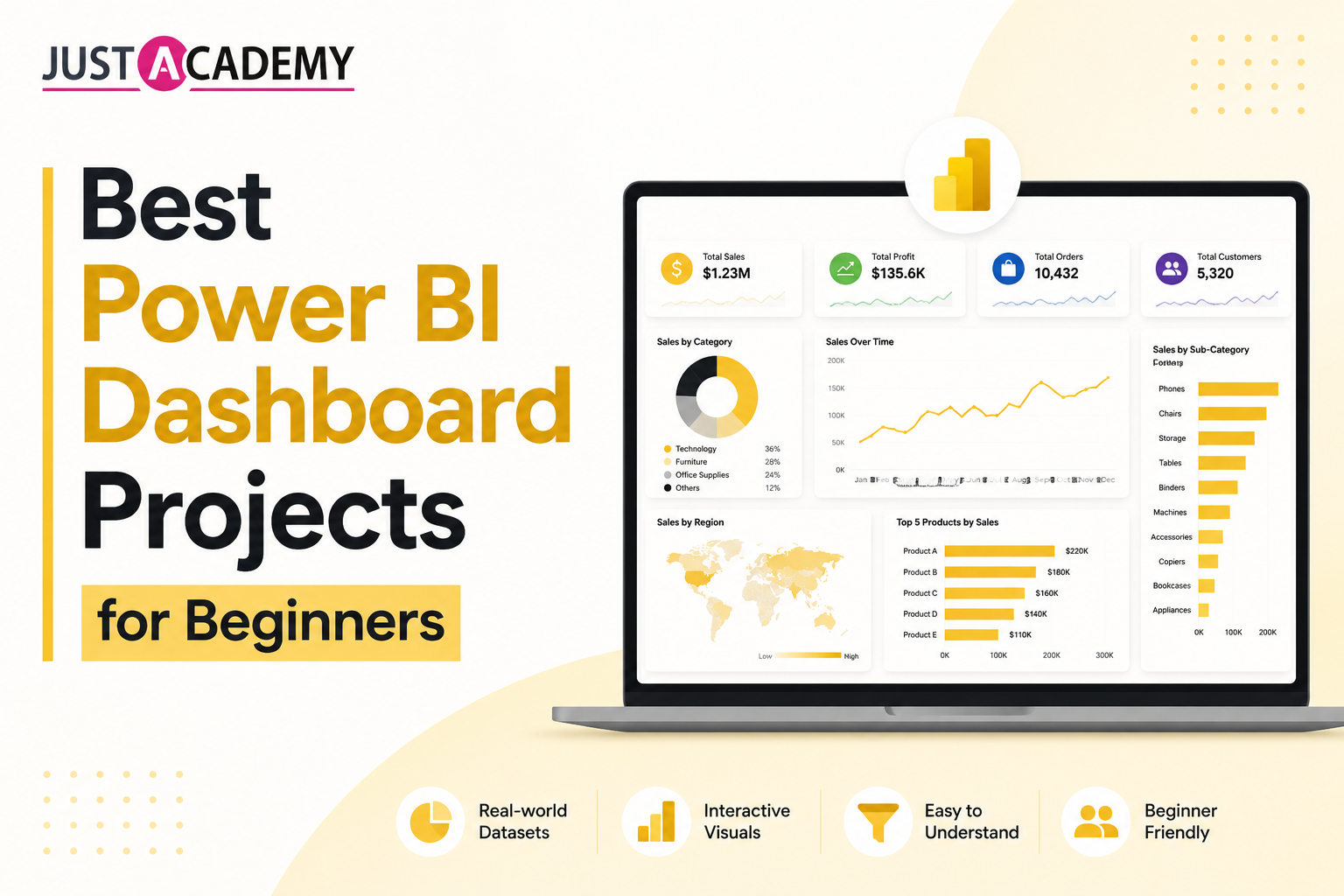
Best Power BI Dashboard Projects for Beginners
If you are learning Power BI and wondering what to actually build, you are not alone. Most beginners finish a course, know the basics, and then freeze when it comes to creating something real. The answer is simple — start with structured Power BI dashboard projects that mirror what businesses actually need. This guide covers the best beginner dashboard projects, where to find data, how to build them, and how to showcase them to land your first analytics role.
Why Power BI Dashboard Projects Matter in 2026
Power BI is the most widely used business intelligence tool in corporate India and globally. Microsoft's ecosystem dominance means it appears in job descriptions across BFSI, consulting, retail, healthcare, and e-commerce. Knowing Power BI theory is not enough — employers want to see working dashboards you have built yourself.
A strong Power BI portfolio proves:
- You can connect to data sources and model relationships
- You understand DAX for calculated measures and KPIs
- You can design clean, business-friendly layouts
- You can translate raw data into actionable business insights
- You are ready to contribute from day one without hand-holding
Three polished Power BI dashboard projects on your portfolio will outperform a dozen certificates in any interview.
What Every Beginner Power BI Project Should Include
Before building anything, understand the standard structure interviewers expect:
- A clear business problem or question the dashboard answers
- At least one data transformation step done in Power Query
- Relationships between at least two tables in the data model
- DAX measures for key metrics — not just dragging columns
- Multiple visualization types used appropriately
- Slicers and filters that make the dashboard interactive
- A clean, professional layout with consistent color scheme
- Published to Power BI Service with a shareable link
Build every project with this checklist in mind.
Best Power BI Dashboard Projects for Beginners
Project 1: Sales Performance Dashboard
Difficulty: Beginner Dataset: Superstore Sales — Kaggle Keywords: sales dashboard Power BI, Power BI projects for beginners, retail analytics dashboard
This is the classic starting project for every Power BI beginner and for good reason — sales dashboards are the most requested deliverable in analytics roles across every industry.
What to build: A multi-page dashboard showing total revenue, units sold, profit margin, sales by region, top 10 products by revenue, and month-over-month sales growth. Add a KPI card section at the top for at-a-glance metrics and slicers for year, region, and product category.
Key DAX measures to write: Total Revenue, Total Profit, Profit Margin %, MoM Revenue Growth %, Year-to-Date Sales, and Sales vs Target variance.
Pages to include: Executive Summary, Regional Breakdown, Product Performance, and Monthly Trend Analysis.
Business question to answer: Which regions and product categories are most profitable, and where are sales declining that require immediate attention?
Source code and file: Save your .pbix file to GitHub. Document the DAX measures, data model screenshot, and a brief README explaining the business context and your design decisions.
Project 2: HR Analytics and Employee Attrition Dashboard
Difficulty: Beginner to Intermediate Dataset: IBM HR Analytics Employee Attrition — Kaggle Keywords: HR analytics Power BI dashboard, employee attrition dashboard, beginner Power BI projects with source code
HR dashboards are extremely common in large enterprises and consulting firms. This project gives you a chance to work with people data and build something with direct business impact.
What to build: A dashboard tracking overall attrition rate, attrition by department, age group, salary band, job role, and tenure. Include a satisfaction score analysis showing correlation between engagement and attrition. Add conditional formatting to flag high-risk departments.
Key DAX measures to write: Attrition Rate %, Average Tenure, Average Monthly Income by Department, Satisfaction Score Average, and Headcount by Department.
Pages to include: Attrition Overview, Department Deep Dive, Employee Demographics, and Risk Indicators.
Business question to answer: Which departments and employee profiles have the highest attrition risk, and what factors most strongly predict an employee leaving?
Source code and file: Share the .pbix file on GitHub. Include a written summary of your top three findings and what HR actions you would recommend based on the data.
Project 3: Financial Performance Dashboard
Difficulty: Intermediate Dataset: Financial Sample dataset — available directly in Power BI Desktop under sample data Keywords: financial dashboard Power BI, Power BI finance project, budget vs actual dashboard
Finance dashboards are among the highest-value deliverables in any organization. Building one as a beginner project signals maturity and business awareness to interviewers.
What to build: A P&L style dashboard showing revenue, cost of goods sold, gross profit, operating expenses, and net profit. Build a budget versus actual comparison view. Add trend lines for quarterly performance and a waterfall chart showing how each cost category contributes to profit.
Key DAX measures to write: Gross Profit Margin %, Net Profit %, Budget Variance, Budget Variance %, YoY Revenue Growth, and Rolling 3-Month Average Revenue.
Pages to include: P&L Summary, Budget vs Actual, Cost Breakdown, and Quarterly Trends.
Business question to answer: Which segments and countries are most profitable, and where is actual performance falling short of budget targets?
Source code and file: This dataset is built into Power BI — no download needed. A great opportunity to show clean data modeling from scratch within the tool itself.
Project 4: E-Commerce Customer Behaviour Dashboard
Difficulty: Intermediate Dataset: Brazilian E-Commerce by Olist — Kaggle Keywords: e-commerce Power BI dashboard, customer analytics dashboard, Power BI projects with source code
E-commerce analytics is one of the most in-demand skills in India right now. This project involves multiple related tables — perfect for practicing data modeling and relationships in Power BI.
What to build: A customer behaviour dashboard showing total orders, average order value, customer acquisition by month, repeat purchase rate, top cities by order volume, delivery performance, and review score distribution. Use map visuals to show geographic order density across Brazil.
Key DAX measures to write: Average Order Value, Repeat Customer Rate %, Delivery Success Rate %, Average Review Score, Customer Lifetime Value estimate, and Orders by Month.
Pages to include: Order Overview, Customer Segmentation, Delivery Performance, and Geographic Analysis.
Business question to answer: Which cities have the highest order volume, which product categories have the best review scores, and how does delivery time affect customer satisfaction?
Source code and file: This dataset has eight related tables — document your data model relationships clearly in your GitHub README. This alone sets your project apart from most beginner submissions.
Project 5: COVID-19 Global Tracker Dashboard
Difficulty: Beginner Dataset: Our World in Data COVID-19 dataset — free download Keywords: COVID data Power BI dashboard, public health dashboard, data visualization Power BI project
This project is excellent for beginners because the dataset is clean, globally recognized, and works perfectly with Power BI's map and time-series visuals.
What to build: A global tracker showing total cases, deaths, recoveries, and vaccination rates by country. Build a time-series line chart showing the progression of cases over time. Add a world map visual with bubble sizes representing case counts. Include slicers for country, continent, and date range.
Key DAX measures to write: Case Fatality Rate %, Vaccination Coverage %, New Cases 7-Day Rolling Average, Deaths per Million, and Recovery Rate %.
Pages to include: Global Overview, Country Comparison, Vaccination Tracker, and Timeline Analysis.
Business question to answer: Which countries had the highest case fatality rates and which had the fastest vaccine rollout — and is there a correlation between vaccination speed and mortality outcomes?
Source code and file: Link to the Our World in Data source in your README. Explain any data cleaning steps you did in Power Query — date formatting, removing null countries, handling negative values.
Project 6: Retail Inventory Management Dashboard
Difficulty: Intermediate Dataset: Retail Dataset of a Global Superstore — Kaggle Keywords: inventory dashboard Power BI, supply chain analytics Power BI, retail Power BI project
Inventory and supply chain analytics is a major hiring domain in India, particularly in retail, FMCG, and manufacturing. This project targets a very specific operational problem — making it highly credible in interviews.
What to build: A dashboard tracking stock levels, stockout frequency, inventory turnover rate, overstock situations, and reorder alerts. Build a product performance matrix showing which items move fastest and which are sitting in inventory longest. Add conditional formatting to flag critical stock levels.
Key DAX measures to write: Inventory Turnover Rate, Days of Inventory Outstanding, Stockout Rate %, Overstock Value, and Reorder Point calculation.
Pages to include: Inventory Overview, Product Movement Analysis, Stockout Alerts, and Supplier Performance.
Business question to answer: Which products are consistently understocked or overstocked, and what reorder strategy would minimize both lost sales and excess inventory costs?
Source code and file: Include a data dictionary in your README explaining what each column means. Interviewers appreciate candidates who document their understanding of the data, not just the visuals.
Project 7: Marketing Campaign Performance Dashboard
Difficulty: Intermediate Dataset: Marketing Campaign dataset — Kaggle Keywords: marketing analytics Power BI, campaign dashboard Power BI, digital marketing dashboard project
Marketing teams love dashboards. This project targets digital marketing analyst roles — one of the most active hiring areas in India's startup and e-commerce ecosystem.
What to build: A campaign performance dashboard showing impressions, clicks, conversions, cost per click, cost per acquisition, and return on ad spend by channel and campaign. Build a funnel visualization showing drop-off from impression to conversion. Add audience demographic breakdowns.
Key DAX measures to write: Click Through Rate %, Conversion Rate %, Cost Per Acquisition, Return on Ad Spend, and Revenue per Campaign.
Pages to include: Campaign Overview, Channel Comparison, Audience Analysis, and ROI Summary.
Business question to answer: Which marketing channels deliver the best return on investment and which audience segments convert at the highest rate?
Source code and file: Add a written one-page recommendation to your GitHub README as if you were presenting to a CMO. This shows business communication skills alongside technical execution.
Project 8: Hospital Patient Analytics Dashboard
Difficulty: Intermediate to Advanced Dataset: Hospital Patient Records dataset — Kaggle Keywords: healthcare Power BI dashboard, patient analytics dashboard, hospital data visualization project
Healthcare analytics is growing rapidly in India. A hospital dashboard project targets health-tech, insurance, and hospital management roles — all of which pay well and have significant demand.
What to build: A patient analytics dashboard showing total admissions, average length of stay, bed occupancy rate, readmission rate, diagnosis category distribution, and patient demographics. Build a department-level breakdown and a monthly admission trend line.
Key DAX measures to write: Bed Occupancy Rate %, Average Length of Stay, Readmission Rate %, Patient Satisfaction Score Average, and Cost per Patient.
Pages to include: Admissions Overview, Department Performance, Patient Demographics, and Readmission Analysis.
Business question to answer: Which departments have the highest readmission rates and longest average stays, and what patient profiles are most associated with extended hospitalization?
Source code and file: Note any data privacy considerations in your README — even with a public dataset. This shows professionalism and awareness of real-world data governance requirements.
Project 9: IPL Cricket Analytics Dashboard
Difficulty: Beginner to Intermediate Dataset: IPL Complete Dataset — Kaggle Keywords: sports analytics Power BI, IPL data dashboard, fun Power BI projects for beginners India
This is one of the most engaging beginner projects for an Indian audience. It uses a familiar, exciting dataset and produces visuals that are genuinely fun to explore — which means you will actually finish it.
What to build: A dashboard tracking team performance across seasons — win rates, run rates, top batsmen by runs, top bowlers by wickets, toss impact on match outcomes, and venue-wise win percentages. Add season-wise filters and head-to-head team comparisons.
Key DAX measures to write: Win Rate %, Average Runs per Match, Economy Rate, Strike Rate, Toss Win to Match Win Conversion %, and Season-wise Rankings.
Pages to include: Season Overview, Team Performance, Player Stats, and Venue Analysis.
Business question to answer: Which teams and players have been most consistently dominant across IPL seasons, and how much does winning the toss actually influence match outcomes?
Source code and file: This is a great project to write a Medium or LinkedIn article about. "What IPL data tells us about winning cricket" — that kind of content builds your personal brand alongside your technical portfolio.
Project 10: Personal Finance Tracker Dashboard
Difficulty: Beginner Dataset: Create your own or use a sample personal finance dataset from Kaggle Keywords: personal finance Power BI dashboard, beginner Power BI project with source code, budget tracker dashboard
This project is unique because you can use your own data — making it genuinely personal and highly memorable in interviews. It also demonstrates that you use the tools you are learning in your own life, which signals real commitment.
What to build: A monthly expense tracker showing spending by category — rent, food, transport, entertainment, savings. Build a budget versus actual comparison. Add a savings rate trend line and an income versus expense waterfall chart.
Key DAX measures to write: Total Monthly Spend, Savings Rate %, Budget Variance by Category, Spending MoM Change %, and Year-to-Date Savings.
Pages to include: Monthly Overview, Category Breakdown, Budget vs Actual, and Savings Trend.
Business question to answer: Which spending categories consistently exceed budget, and what adjustments would allow hitting a 20% monthly savings target?
Source code and file: If using real personal data, anonymize amounts before sharing. The structure and DAX logic matter more than the actual numbers.
How to Share Beginner Power BI Projects With Source Code
The phrase beginner Power BI projects with source code comes up repeatedly in job searches because employers want to see how you built something, not just the finished visual. Here is how to share your work properly:
- Save your .pbix file and upload it to a GitHub repository
- Write a README with the business problem, dataset source, data model screenshot, key DAX measures, and your findings
- Publish the dashboard to Power BI Service and include the public link
- Take a screenshot of each page and add them to the GitHub README so it previews without needing to open the file
- Add a brief video walkthrough using Loom — a 3-minute screen recording explaining the dashboard adds significant impact
Common Mistakes Beginners Make in Power BI Projects
- Using too many colors with no consistent theme — stick to two to three brand colors
- Overloading a single page with too many visuals — one story per page
- Using default chart titles — always write custom, meaningful titles
- Forgetting to write DAX measures and only using auto-aggregations
- Not documenting the data model — relationships are what make Power BI powerful
- Publishing without testing slicers and filters — always QA before sharing
- Skipping Power Query — every project should have at least one transformation step documented
Accelerate Your Power BI Skills With Structured Training
Learning Power BI through trial and error works eventually but takes much longer than learning with a structured curriculum, real datasets, and mentor feedback. A dedicated bootcamp gets you from beginner to portfolio-ready in weeks rather than months.
For classroom training in Mumbai with hands-on Data analytics projects
For live online training with real-world Data Analytics projects available across India and globally
Book a free demo session to see the curriculum in action
Download the full course brochure with syllabus and placement details
Also Explore These Bootcamps in Mumbai
Full Stack Java Developer Bootcamp — Mumbai
Full Stack QA Automation Bootcamp — Mumbai
MERN Stack Developer Bootcamp — Mumbai
Final Thoughts
The best Power BI dashboard project is the one you actually finish and publish. Pick one from this list today. Download the dataset. Open Power BI Desktop. Start building. The first project will feel slow and uncertain — that is completely normal. By the third project you will be building dashboards confidently and explaining your design decisions clearly in interviews.
Every senior analyst you admire built their first messy, imperfect dashboard once. Yours is next.
Why Power BI Dashboard Projects Matter in 2026
Best Power BI Dashboard Projects for Beginners
How to Share Beginner Power BI Projects With Source Code
Common Mistakes Beginners Make in Power BI Projects