Flutter User Interface Guidelines
Flutter UI Design Principles
Flutter User Interface Guidelines
Flutter user interface guidelines emphasize the creation of aesthetically pleasing and highly functional applications that adhere to material design principles. They promote consistency, accessibility, and responsiveness across various devices by encouraging developers to utilize pre-built widgets that follow design patterns and interactions. The guidelines advocate the use of intuitive layouts, clear navigation, and understandable visual hierarchy, ensuring that apps are user-friendly. Additionally, Flutter encourages the incorporation of platform-specific design elements when necessary, allowing for a seamless experience on both Android and iOS platforms while maintaining a cohesive brand identity. Ultimately, the goal is to enhance user engagement and satisfaction through thoughtful and innovative design practices.
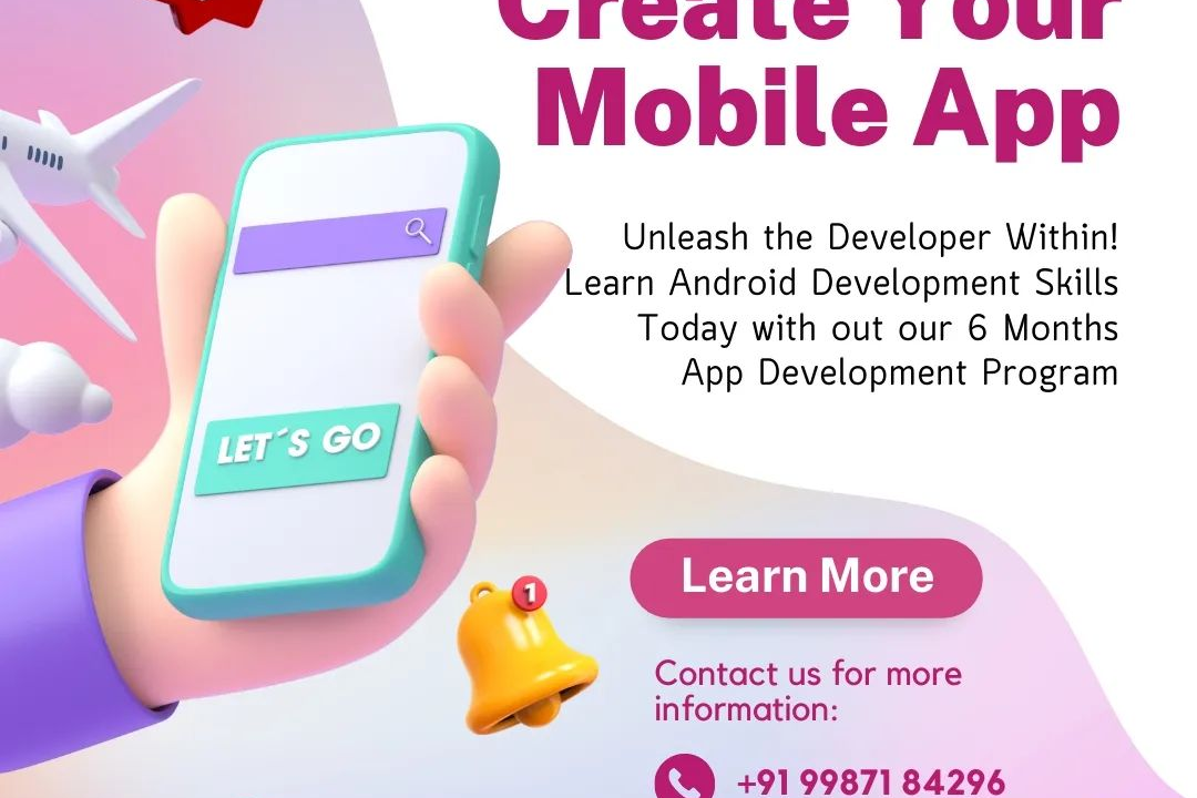
To Download Our Brochure: https://www.justacademy.co/download-brochure-for-free
Message us for more information: +91 9987184296
1 - Material Design Principles: Flutter incorporates Material Design, which emphasizes clarity, boldness, and hierarchy. Understanding these principles ensures that applications are visually appealing and intuitive.
2) Widgets as the Building Blocks: Flutter's UI is constructed using widgets. Each component, whether it’s a button or a layout, is a widget, making it essential to understand their properties and behaviors.
3) Consistency: Maintain consistency in your app’s colors, typography, and spacing. This enhances user experience and makes the application look professional.
4) Responsive Layouts: Design layouts that adapt to different screen sizes and orientations. Utilize flexible layouts like `Column`, `Row`, and `Flexible` widgets to achieve responsiveness.
5) Effective Use of Colors: Choose a color scheme that conveys the app's purpose and emotional tone. Flutter provides easy customization options for themes to manage colors throughout the app.
6) Typography Guidelines: Use typography to establish hierarchy and improve readability. Implement standard font sizes and styles based on Material Design guidelines to maintain a cohesive look.
7) Use of Icons: Icons should be meaningful and enhance the user's ability to identify actions and content. Flutter has a rich library of icons that follow Material Design standards.
8) Touch Targets: Ensure that touch targets (like buttons) are large enough (at least 48x48 dp) to make interaction easy for users. This is vital for accessibility and usability.
9) Gestures and Animation: Make use of Flutter's gesture detection and animation capabilities to create engaging interactions. Smooth transitions and animations enhance user experience.
10) Accessibility Considerations: Design apps that are usable for everyone, including individuals with disabilities. Implement semantic labels, voiceover support, and high contrast themes.
11) Navigation and User Flow: Design clear and logical navigation paths within the app. Use `Navigator` and routes wisely to provide a seamless user experience.
12) Feedback Mechanisms: Provide instant feedback when users interact with the app. Use Material’s feedback widgets like `SnackBar` or `Dialog` to inform users of actions and changes.
13) State Management: Understand different state management approaches in Flutter, like Provider, Bloc, or GetX. Choosing the right approach is fundamental for managing UI state effectively.
14) Layout Guidelines: Utilize Flutter's layout guidelines such as `Padding`, `Margin`, and `Alignment` to achieve a well structured UI. Proper layout helps in achieving a clean interface.
15) Testing UI: Encourage the habit of testing UI with tools like Flutter's widget tests. This ensures that the interface behaves as expected across different devices and scenarios.
16) Internationalization (i18n): Plan for multiple languages and locales. Flutter provides support for internationalization, making it easier to reach a global audience through localized UI.
17) User Centered Design: Always focus on the needs and preferences of your users. Conduct user testing and gather feedback to inform design decisions.
By covering these points, students will gain a comprehensive understanding of Flutter’s user interface guidelines, which will help them create beautiful and functional applications.
Browse our course links : https://www.justacademy.co/all-courses
To Join our FREE DEMO Session: Click Here
Contact Us for more info:
Java Application Performance Tuning
Testing android apps
JAVASCRIPT NEAR ME
Women in android development
Flutter Training in Moradabad