Flutter UI Components
Essential Flutter UI Components for Modern App Development
Flutter UI Components
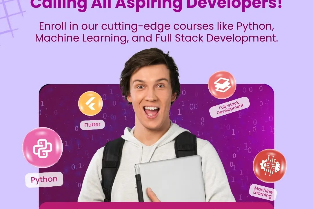
Flutter provides a rich set of UI components, known as widgets, which are the basic building blocks for creating user interfaces. These widgets are highly customizable and can be combined to create complex UIs. Flutter offers two primary categories of widgets: StatelessWidgets, which do not maintain any mutable state, and StatefulWidgets, which do maintain state across changes. Additionally, Flutter incorporates a wide range of pre-designed widgets for layout, text, images, animations, and interactivity, including Material Design and Cupertino (iOS-style) components. The framework’s reactive nature allows developers to create smooth and responsive UIs that adapt seamlessly to different screen sizes and orientations, ensuring a native-like performance across various platforms. Furthermore, Flutter’s rich ecosystem includes tools for theming, gesture detection, and animations, empowering developers to create visually appealing applications with ease.
To Download Our Brochure: https://www.justacademy.co/download-brochure-for-free
Message us for more information: +91 9987184296
1 - Widgets: The core building blocks of a Flutter app's UI, comprising both stateful and stateless widgets, allowing for comprehensive layout and design.
2) Material Design: Flutter incorporates Material Design components that provide a modern look and feel. This includes widgets like AppBar, FloatingActionButton, and Card.
3) Cupertino Widgets: These are iOS style widgets that mimic native iOS design patterns, allowing developers to create applications that feel at home on Apple devices.
4) Text: The Text widget is used for displaying strings of text, supporting various styles, fonts, and alignment options, crucial for any user interface.
5) Containers: A versatile widget that can hold multiple other widgets, defining properties like padding, margins, decoration, and constraints to create complex layouts.
6) Row and Column: These are layout widgets used to arrange children in a horizontal (Row) or vertical (Column) linear layout, making it easy to design responsive interfaces.
7) Stack: The Stack widget allows for overlapping widgets within a single screen space, useful for creating complex designs where widgets might need to overlap each other.
8) ListView: A scrollable list of widgets that allows users to view and interact with large amounts of data, enhancing user experience with lazy loading for better performance.
9) GridView: Displays items in a two dimensional, scrollable grid layout, suitable for photo galleries or any layout where a grid structure is preferred.
10) Form & TextFormField: Widgets designed for capturing user input, allowing validation and offering a structured way to handle user data.
11) Buttons: Various types of buttons (ElevatedButton, TextButton, IconButton, etc.) are available for triggering actions, enhancing interactivity within the app.
12) Dialog & SnackBar: These components are used to display brief messages or alerts to the user without interrupting the flow of the application.
13) Image: The Image widget enables displaying images from local assets, files, or the network, enhancing the visual appeal of the app.
14) Icons: Flutter provides a rich set of icons that can be customized in size and color, improving the graphical interface and aiding user navigation.
15) Animation: Flutter supports animations that can be easily integrated into widgets, providing visual feedback and enhancing user experience through transitions and movements.
16) Drawer: A slide in menu from the side of the screen, typically used for navigation, allowing users to access different sections of the app quickly.
17) BottomNavigationBar: A widget for switching between different pages of an app, typically placed at the bottom of the app, improving navigation efficiency.
18) Slider: A widget that allows users to select a value from a range, commonly used for settings like volume or brightness adjustment.
19) Progress Indicators: Widgets such as LinearProgressIndicator and CircularProgressIndicator provide visual cues about ongoing processes, enhancing user feedback.
These points provide a broad overview of essential Flutter UI components that can be covered in a training program. Each component can be explored in further detail through practical examples, hands on coding sessions, and design exercises.
Browse our course links : https://www.justacademy.co/all-courses
To Join our FREE DEMO Session: Click Here
Contact Us for more info:
- Message us on Whatsapp: +91 9987184296
- Email id: info@justacademy.co
Java Web Performance Optimization